Hi Astro fam!
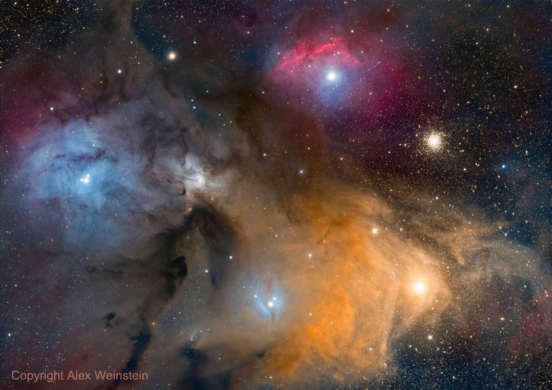
I finally went to a bortle 2 site in California and got the most amazing image of Rho Ophiuchi. I have been wanting to shoot this forever, but never could do it. Any constructive feedback on processing would be appreciated! It’s my favorite image so far.
https://www.astrobin.com/dab9mg/ |
You cannot like this item. Reason: "ANONYMOUS".
You cannot remove your like from this item.
Editing a post is only allowed within 24 hours after creating it.
You cannot Like this post because the topic is closed.
Hi, first of all, very good data and processing! I only can dream of that..
In my opinion it has a bit to much blue/purple in it. I think also the background has a blue touch, maybe you could keep the color more neutral and make the saturation more intense only in specific areas (e.g. color mask).
And second point, maybe try to dim the bright stars a bit, it looks like they are a bit overexposed.
|
You cannot like this item. Reason: "ANONYMOUS".
You cannot remove your like from this item.
Editing a post is only allowed within 24 hours after creating it.
You cannot Like this post because the topic is closed.
Lovely image, but I would say the background is a little purple.
Carole
|
You cannot like this item. Reason: "ANONYMOUS".
You cannot remove your like from this item.
Editing a post is only allowed within 24 hours after creating it.
You cannot Like this post because the topic is closed.
|
Thank you! I will try to reduce that a bit
|
You cannot like this item. Reason: "ANONYMOUS".
You cannot remove your like from this item.
Editing a post is only allowed within 24 hours after creating it.
You cannot Like this post because the topic is closed.
|
Simple adjustment of the tint and warmth did the trick, I think
|
You cannot like this item. Reason: "ANONYMOUS".
You cannot remove your like from this item.
Editing a post is only allowed within 24 hours after creating it.
You cannot Like this post because the topic is closed.
Beautiful image!!
Still seems a bit purplish.
How did you do the color calibration?
If using PI, I would try SPCC to get your color balance.
Bright star areas seem a bit blown out. Try stretching with GHS in PI.
CS
Pete
|
You cannot like this item. Reason: "ANONYMOUS".
You cannot remove your like from this item.
Editing a post is only allowed within 24 hours after creating it.
You cannot Like this post because the topic is closed.
Hi, I don't mind at all the saturation 
In my opinion you need to be more careful with BlurXterminator and denoising. BlurX has messed the stars at the corners, introduced strange star halos (although maybe this is a byproduct of working separately with a "starless" and a "stars" image) and have turned stars into salt-and-pepper noise. I also think you have to dial down the denoising strength. And, as @Carastro said, the background is a bit purple.
|
You cannot like this item. Reason: "ANONYMOUS".
You cannot remove your like from this item.
Editing a post is only allowed within 24 hours after creating it.
You cannot Like this post because the topic is closed.
|
Looks awesome... I like the colors a lot. How were stars removed? starXterminator and screened on? Sometimes when an image gets overprocessed, the difference between the two (stars and background) makes it hard to put back together and look natural. In the corners, it looks like maybe too much contrast on the stars makes them look sharper, but also less natural. But really cool image, I like it a lot as I'm trying a 2x3 mosaic on this same target. Super hard at less than 20° all the time.
|
You cannot like this item. Reason: "ANONYMOUS".
You cannot remove your like from this item.
Editing a post is only allowed within 24 hours after creating it.
You cannot Like this post because the topic is closed.
|
The things I would try to adjust is the sharp lines around stars, brightness of stars, and reduce the noise reduction. Overall I like it, it's probably my favorite region of the sky and you've got a great set of data. It seems like the stars were overstretched and over sharpened. And noise reduction may be contributing to that, so might try applying noise reduction to the background separate from the stars. For star brightness, I've started stretching them separate from the background or extracting them after an initial stretch that gets stars to where I want them. This is a bit tougher if using GHS and I've played around with stretching clones for different purposes.
|
You cannot like this item. Reason: "ANONYMOUS".
You cannot remove your like from this item.
Editing a post is only allowed within 24 hours after creating it.
You cannot Like this post because the topic is closed.
Thank you all for the insight! I am working on a re-process now with all your feedback incorporated (to the best of my ability!).
Thank you again and clear skies.
|
You cannot like this item. Reason: "ANONYMOUS".
You cannot remove your like from this item.
Editing a post is only allowed within 24 hours after creating it.
You cannot Like this post because the topic is closed.
|
I'm very familiar with the target and equipment used, I've also spent time working on it myself. https://www.astrobin.com/u6v4v9/ I've always found that adding a second night of data helps with the color balance. Once you are above 6-8 hours, it will process easier. Right now you have 3 hours or RGB data. With my filters I get good results without needing extra time on L. For this target however you need more RGB. If you are a NINA user, use the advanced sequencer to rotate filters after every second exposure. If you shoot LRGB like 10-10-10-10 throughout the night, the gradient from the different levels of light pollution and earth's atmosphere will also affect processing. The best way to avoid that is to rotate the filters frequently so each filter ends up with the same SNR. In processing, use SPCC and make sure to select an area of interest somewhere in the corner without nebulosity so your background will not have a hue to it. Good luck.
|
You cannot like this item. Reason: "ANONYMOUS".
You cannot remove your like from this item.
Editing a post is only allowed within 24 hours after creating it.
You cannot Like this post because the topic is closed.
Lots of detail with good colors.
I would go easier on the noise reduction; close inspection shows a somewhat plastic look. Ten hours of data from Bortle 2 doesn't need much help.
|
You cannot like this item. Reason: "ANONYMOUS".
You cannot remove your like from this item.
Editing a post is only allowed within 24 hours after creating it.
You cannot Like this post because the topic is closed.
The revision you have up there is not far off from how I personally would do it! If you did a BackgroundNeutralization on that, you'll fix the purple hue that overwhelms some areas. Then you'll have some green residue that SCNR Green will fix. These two small steps really allow all the colors to pop and the dust to look more natural, in my opinion. Here's a link of that result on your jpg that I downloaded, for reference.
https://i.postimg.cc/htGR0xfK/en8w-PLCZWbfs-16536x0-RXX7-B9s-K.jpg |
You cannot like this item. Reason: "ANONYMOUS".
You cannot remove your like from this item.
Editing a post is only allowed within 24 hours after creating it.
You cannot Like this post because the topic is closed.
|
I did the background neutralization and SCNR in target areas and re-uploaded as a stop-gap for now, while I am processing some other stuff! I am going to keep doin ga full process now too
|
You cannot like this item. Reason: "ANONYMOUS".
You cannot remove your like from this item.
Editing a post is only allowed within 24 hours after creating it.
You cannot Like this post because the topic is closed.
|
I really like your saturation and the bright mustard color of the yellow. Everything is near perfect, but there is that slight blue color close to the edges of the image (more specifically the top right and bottom right areas), I'm not sure if that's also a reflection nebula or some type of gradient, I don't know, it's hard to tell for me. But in comparison with other Rho Ophiuchi images, this is my favorite.
|
You cannot like this item. Reason: "ANONYMOUS".
You cannot remove your like from this item.
Editing a post is only allowed within 24 hours after creating it.
You cannot Like this post because the topic is closed.
|
The blue is pretty persistent. I think I need to do a gradient removal at the blue channel level and not the combined image level. This will be fun…
|
You cannot like this item. Reason: "ANONYMOUS".
You cannot remove your like from this item.
Editing a post is only allowed within 24 hours after creating it.
You cannot Like this post because the topic is closed.
Hey fam! Just uploaded a new revision. Would love your insights.
https://www.astrobin.com/dab9mg/D/ |
You cannot like this item. Reason: "ANONYMOUS".
You cannot remove your like from this item.
Editing a post is only allowed within 24 hours after creating it.
You cannot Like this post because the topic is closed.
First off I think this is a very nice image. Better than my attempts at the same target.
Two thoughts in the future.
1. This is a very bright colorful area. Perhaps straight RGB would have been better instead of LRGB as you wouldn't need to do as much noise reduction for the color. You'd have higher color resolution and therefore cleaner color separation resulting in less "plasticky" processing.
2. Wonder Valley is not bortle 2, it's maybe Bortle 4 at best (and rating a site by the bortle scale is it's own can of worms that there is plenty of other discussion about). Add to that, this target would have been lower to the south so you'd be shooting through the LP of Palm Springs and the Coachella Valley which has gotten much much brighter in the last decade. If you head another hour or so east into the Cadiz or Rice areas you'll be right on the edge of B2/B3. For darker skies than that you'll want to head into northern Death Valley
Which leads me to think that you likely had a good amount of gradients to work through and smooth out which can certainly affect color fidelity and introduce noise.
|
You cannot like this item. Reason: "ANONYMOUS".
You cannot remove your like from this item.
Editing a post is only allowed within 24 hours after creating it.
You cannot Like this post because the topic is closed.
I would touch a bit on the LocalHistogramEqualization, to bring out the details: on Kernel Radius i would use 32 for the small details and i repeat the process for the bigger details, but with a value of 128.
Slight increase in sharpness! Other than that is a great picture!
Well done!
Omiros
|
You cannot like this item. Reason: "ANONYMOUS".
You cannot remove your like from this item.
Editing a post is only allowed within 24 hours after creating it.
You cannot Like this post because the topic is closed.
Dan Watt:
First off I think this is a very nice image. Better than my attempts at the same target.
Two thoughts in the future.
1. This is a very bright colorful area. Perhaps straight RGB would have been better instead of LRGB as you wouldn't need to do as much noise reduction for the color. You'd have higher color resolution and therefore cleaner color separation resulting in less "plasticky" processing.
2. Wonder Valley is not bortle 2, it's maybe Bortle 4 at best (and rating a site by the bortle scale is it's own can of worms that there is plenty of other discussion about). Add to that, this target would have been lower to the south so you'd be shooting through the LP of Palm Springs and the Coachella Valley which has gotten much much brighter in the last decade. If you head another hour or so east into the Cadiz or Rice areas you'll be right on the edge of B2/B3. For darker skies than that you'll want to head into northern Death Valley
Which leads me to think that you likely had a good amount of gradients to work through and smooth out which can certainly affect color fidelity and introduce noise.
Thank you very much for taking a look! I will give it another shot with just RGB instead of using the L in there. Regarding the bortle number, I actually think this is a 3ish given how far out east this is. It is at the end of when Amboy road goes east (34.10.36N / 115.43.51W). The nice thing about this site is that you can draw a line through bortle 3ish all the way to el centro, which is 100 miles away. Not a lot of glow. Highly recommend if you are based in socal
|
You cannot like this item. Reason: "ANONYMOUS".
You cannot remove your like from this item.
Editing a post is only allowed within 24 hours after creating it.
You cannot Like this post because the topic is closed.
The only thing wrong with this image is that it isn't mine!
Great job.
|
You cannot like this item. Reason: "ANONYMOUS".
You cannot remove your like from this item.
Editing a post is only allowed within 24 hours after creating it.
You cannot Like this post because the topic is closed.
|
It think a little less saturation would help, if not for the nebula but for space. Some areas of space are too purple in my opinion.
|
You cannot like this item. Reason: "ANONYMOUS".
You cannot remove your like from this item.
Editing a post is only allowed within 24 hours after creating it.
You cannot Like this post because the topic is closed.
to create to post a reply.


