Hi All,
I am curious about any solutions or experiences others might have had with color. I had a recent, and unresolved issue with color reproduction of an image I wanted to print at a commercial outfit. At this outfit, I have had a number of prints done, choosing metal prints and got decent results for some. While this is likely more of a minor issue for those who are viewing or printing in false color, it seems to be problematic for the typical natural colors I shoot. The one most recent I failed. Luckily, the processing outfit allowed for limited free test prints to be made. After I got the first print back I noted a significan shift in the image compared to what I see on my monitor and, therefore what I developed during my own processing. So, I developed a method of altering the balances, expecting the next test print coming off their printer to be adjusted. (Of course these adjustments made the image I view on my monitor look skewed.) The new test print was altered, but now tended to more resemble the out-of-balance look I saw on the computer monitor! So what to do?!
The following are a list of issues I have with color that I think are relevant to the issue I am having. Not solutions, but observations. And I know it will come up, so I need to state up front that I have not used a monitor calibrator to calibrate my monitor. And I know that will get me in all sorts of trouble in this forum. Do not hold back, but I did do a calibration by other means, and I have my reasons for not using a calibrator.
The list:
1. The colors I see on my monitor matches fully my expectations of what these objects should look like. Not just my images, but of the thousands of images I have seen here on AB and other sites.
2. The colors I see of terrestrial subjects on my monitor match perfectly my expectations. That includes my images of people, landscapes etc. Also images of places I have been but taken by others.
3. The colors I see on other monitors, including multiple phone images match very well those I see on my monitor. That includes AB images of mine and others' astroimages.
4. My ability to see rather subtle color shifts is probably not so bad  . Reason I say this is that I use lightly yellow-tinted eye strain-relief glasses dedicated for computer work and when I forget to take them off for my final color adjustments, I usually catch this and have to revise my posts here. It is subtle sometimes, but I know that I can see it. . Reason I say this is that I use lightly yellow-tinted eye strain-relief glasses dedicated for computer work and when I forget to take them off for my final color adjustments, I usually catch this and have to revise my posts here. It is subtle sometimes, but I know that I can see it.
5. For my monitor, my workspace includes two windows and a couple of incandescent-mimicing LED lights. These are on the typical "warm" end of the lighting spectrum. The difference between working on images at my computer with this lighting at night, lights on vs off is not that great regarding color shift. After all, the monitor is generating most of its own light. However, on a sunny day, the monitor is certainly affected. Overall, it appears to not be a huge effect.
6. For prints, I have found that the ambient light that is used to view prints has a profound effect! So much so that I can come to almost two different conclusions about the relatedness of the print to what I see on the monitor depending on ambient room lighting vs. natural light coming through the windows on a sunny day.
7. The previous prints I have made that seem to work best are of those that have the largest percentage of the frame with brighter components. Those seem to better match the ratio of bright vs. dark that are typical of terrestrial images and portraits. Some of my darker images are disappointing, re their relatedness to that which I can see on my monitor, but it is those that, when placed near a bright window or near sunlight look best. Even for very dark images.
So there it is! I think items 1-5 speak towards my not using a monitor calibrator. Bottom line is even though less affected, my monitor perception is still different depending on my office lighting. So even if I tried to do so, would I have to calibrate my office lighting first?! And I don't like working in a cave!
Related to office lighting but addressing issue with placement of prints; Need I first select museum-grade lighting to illuminate my prints prior to dropping the $100+ for a print? Does anyone know of a printer outlet that has a calibration capability to come to the proper settings to get the desired outcome? Is the issue just that prints, can never match the typical full dynamic range that we achieve on our computers? Are there any tricks to overcome whatever the problem is? Have other struggled with this? Are we doomed to only view our images on computer monitors?
To help with this discussion, I provide you with the image I tried to print:

The Intergalactic Traveler's view of M31, The Andromeda Galaxy
Yes, this is not the most dynamic image. Neither in dynamic range or in color saturation. (First this was SPCC'd when the stars were present. It is starless, but I can tell you that the red stars looked red and the blue stars looked blue. This was stretched without much in the way of contrast enhancement. It was also processed without any color saturation.) I had considered doing this in B&W, but I do like the subtle colors. The intent here is not to make this a dramatic image via added H alpha or saturated bright blues so typically done. But rather I want a natural, color calibrated and non-saturation enhanced print. I am no longer in any rush. Having done this with my 61mm doublet, I have decided that I want to recapture data with a larger aperature scope and also go a lot deeper for the background galaxies. Then generate a similar composition.
|
You cannot like this item. Reason: "ANONYMOUS".
You cannot remove your like from this item.
Editing a post is only allowed within 24 hours after creating it.
You cannot Like this post because the topic is closed.
I have not printed any of my Astro images, but I did print a large sunset pic for a friend a couple of years ago... it was a metal print, and I used Printique (https://www.printique.com/products/metal-prints/). The print was very nice and had accurate colors, at least to my eyes.
I do calibrate my monitor periodically (Datacolor) and when I do I try to have the lighting as I would have it when doing the final color adjustment. I'm like you in that I try to adjust the color to give a "natural" look. This is the main reason I rarely work with narrow-band data other than to incorporate it into an RGB image.
As for your image of M31, I think you might want to stretch the stars-only image a bit more so they are more pronounced in the galaxy. In a lot of the galaxy images I have processed, I find that both Starnet++ and StarXterminator remove galaxy stars and star-like structures from the starless image. Sometimes it takes some extra effort to bring these out in the "stars" image while not brightening the Milky Way stars too much. The GAME mask has been very helpful in that regard. I use arcsinh and GHS for stretching. To my taste your M31 should be less yellow and more blue. But that is just my VERY subjective judgment of what looks "natural." LOL! I really like colorful stars in my images and spend a lot of time working on that part of any image. My image of M31 is certainly nothing to brag about... low exposure and a Canon6D. I need to reprocess it.
|
You cannot like this item. Reason: "ANONYMOUS".
You cannot remove your like from this item.
Editing a post is only allowed within 24 hours after creating it.
You cannot Like this post because the topic is closed.
George Hatfield:
I have not printed any of my Astro images, but I did print a large sunset pic for a friend a couple of years ago... it was a metal print, and I used Printique (https://www.printique.com/products/metal-prints/). The print was very nice and had accurate colors, at least to my eyes.
I do calibrate my monitor periodically (Datacolor) and when I do I try to have the lighting as I would have it when doing the final color adjustment. I'm like you in that I try to adjust the color to give a "natural" look. This is the main reason I rarely work with narrow-band data other than to incorporate it into an RGB image.
As for your image of M31, I think you might want to stretch the stars-only image a bit more so they are more pronounced in the galaxy. In a lot of the galaxy images I have processed, I find that both Starnet++ and StarXterminator remove galaxy stars and star-like structures from the starless image. Sometimes it takes some extra effort to bring these out in the "stars" image while not brightening the Milky Way stars too much. The GAME mask has been very helpful in that regard. I use arcsinh and GHS for stretching. To my taste your M31 should be less yellow and more blue. But that is just my VERY subjective judgment of what looks "natural." LOL! I really like colorful stars in my images and spend a lot of time working on that part of any image. My image of M31 is certainly nothing to brag about... low exposure and a Canon6D. I need to reprocess it.
Thanks for your reply George,
I did go to the web site for Printique. I'll have a good look at it. Do you know if they had a color calibration tool or method associated with ordering from digital images?
I think that color calibrating under a standard condition is a very good idea. I will do that. But I think I am going to learn the hard way that the color of the print is just going to be fully dependant on where I hang it and the time of day it is viewed. I have a lot of windows in my home and the prints change so much whether day lighted or night lighted. Again, for the typical saturated false color images that I see so many post from wall hangings at their home, it probably is just not an issue.
Your first sentence regarding the stretch of the stars image is interesting and the reason that I want to repeat the data collection with a larger aperature scope. Given that, I do believe/hope that I lost many of those galactic stars simply to strong undersampling from my 60mm telescope. As you say, clearly I saw extractive losses with STX. Also nebulosity was lost to STX. Hence the process that I used to prevent that. All of the star features you see within the galaxy were returned faithfully from the full-on star image (I.e. image not molested by SXT) using an accurately registered starred image with clone stamp. Same for the nebulosity lost to STX. No need to stretch/boost the M31 stars, since the intent of the image is to faithfully present that which is there consistent within the stretch of the galaxy itself. From our position 2+ million LY away from M31, the only stars resolvable in our puny optics are giants or supergiants. And those are almost always blue or red. All the other stars just are part of the stellar haze.
I understand your reaction to the yellow look of this image. Don't get me wrong, I do like the boosted images of M31 and other objects. But my intention was to reflect reality with this particular image, and hope to do so for others in the future. Almost like an anatomy photo from a biology book. And the following is the arguments I make for this image being more true than most you see here:
Based on the published astrophotography we are saturated with (pun intended) each and every day from NASA, Hubble, Astronomy, S&T, News outlets, etc.) "natural" is truely subjective. Most images we therefore see from those sources and indeed seek to produce ourselves are logically driven or intended to attract attention. Editors of magazines and web sites are quite aware of that. So our being accustomed to what M31 actually looks like from media sources is very suspect to me. I do have other images of M31 and for those, I love the blues and the reds I can boost out of it, even though those are probably still considered too bland for the masses. In any case, I decided to let SPCC tell me what the color is. That is the point of SPCC. To prove that this method is capable of "seeing" color, please check out my image

M33, The Triangulum Galaxy - In OSC, with a Intergalactic Traveler's View in the Mouseover.
This M33 is treated in almost exactly the same way as the M31 galaxy image above, including a Mouseover of a "Starless" view. I am going to trust that SPCC is doing its job here with the M33 and M31 fields. As you, I too thought initially after the SPCC that this M31 seemed uncomfortably yellow. So I looked up published reports to see what was going on. From recent research, the professional data suggests that M33 has 10x the star-forming activity as M31. And M31 has 2-4 times less star-forming activity than that of the Milky Way. M33 also has little or no galactic bulge (where mostly only older stars can be found) hence the justification of its bluer color. The data finds that M31, having much less star-forming activity than the Milky Way also has a much larger old population of stars than the Milky Way and is very consistent with that yellower cast. Especially when it comes to the unresolved stellar haze. Finally, given that the Milky Way has a lot more star-forming activity and fractionally more young blue giants than M31, the Milky Way still does not come across as a "blue" galaxy, such as M33 or M51 for example.
|
You cannot like this item. Reason: "ANONYMOUS".
You cannot remove your like from this item.
Editing a post is only allowed within 24 hours after creating it.
You cannot Like this post because the topic is closed.
Hello Alan,
I’ve not done any metal prints only canvas, calendars & books aside from a bit of just printing on paper with my “normal” printer in my office and what I have noticed mostly is they print dark and have to lighten them up quite a bit. Colors look pretty good to me as well just dark.
I didn’t use a “monitor calibration” unit, just the windows monitor calibration tool. Based on your detailed description I have to assume you’ve done this?
In the past I have always noticed a contrast difference in my images when I’d post them here on AB and commented about it on one of my images. I had a response to that comment and found that when I was saving the image I didn’t assign a ICC Profile (maybe you do but thought I’d mention it) and that is what was causing the contrast difference in my images once posted here on AB. Once I did this the image looks identical in my processing software PI and when its uploaded to AB.
I’m only bringing this up as another thing to check on your end. I don’t know if this would make any difference in the way colors are displayed but certainly in contrast/brightness it made a difference so I just thought I’d mention it.
Good Luck,
Dale
|
You cannot like this item. Reason: "ANONYMOUS".
You cannot remove your like from this item.
Editing a post is only allowed within 24 hours after creating it.
You cannot Like this post because the topic is closed.
What is the natural look? That is the big question when I'm working on an object. This is not the look one would get while looking through a telescope, even a large one, since all, regardless of size, give a grayscale image due to our color-insensitive eyes. Distance is a factor to consider. For my images, I'm assuming the "Star Trek" view, where the observer is not on Earth but much closer to the object. Thus, stars in a galaxy would appear larger and more obvious.
As for color, I look to NASA, APOD, and even Wikipedia to form my impression of what the object should look like. My image of NGC6744 is a good example of where SPCC did not yield the appearance I was looking for. In that case, the overall color of the galaxy was always too blue after SPCC until I ran linear fit on the primaries before combining them to form the RGB. Normally, I then use GraXpert to remove gradients and then run IS and SPCC.
I have also found that SPCC can yield images that are a bit too green in my mind's eye after color calibration, and when that is the case, I use SCNR. A good example is your starless image of M33. Green is not a good look in most images, at least IMHO. Note that I said MY opinion. Others may like it, and that presents no problem to me.
I would be the first to admit that developing the "natural look" of a given object in my processing is a very subjective process. My impression of "natural" may well not line up well with someone else's mind's eye view.
George
|
You cannot like this item. Reason: "ANONYMOUS".
You cannot remove your like from this item.
Editing a post is only allowed within 24 hours after creating it.
You cannot Like this post because the topic is closed.
Dale Penkala:
Hello Alan,
I’ve not done any metal prints only canvas, calendars & books aside from a bit of just printing on paper with my “normal” printer in my office and what I have noticed mostly is they print dark and have to lighten them up quite a bit. Colors look pretty good to me as well just dark.
I didn’t use a “monitor calibration” unit, just the windows monitor calibration tool. Based on your detailed description I have to assume you’ve done this?
In the past I have always noticed a contrast difference in my images when I’d post them here on AB and commented about it on one of my images. I had a response to that comment and found that when I was saving the image I didn’t assign a ICC Profile (maybe you do but thought I’d mention it) and that is what was causing the contrast difference in my images once posted here on AB. Once I did this the image looks identical in my processing software PI and when its uploaded to AB.
I’m only bringing this up as another thing to check on your end. I don’t know if this would make any difference in the way colors are displayed but certainly in contrast/brightness it made a difference so I just thought I’d mention it.
Good Luck,
Dale
Thanks Dale, a whole list of good suggestions from you! You are correct in your assumptin that I did do a windows calibration. But also, there are other tools available to do calibration. It has been a while, so I do not recall which I used, but now there are even more methods you can find by surfing... I know that it had its own software tool. Some may poo poo doing it this way, but as I said, given changing light conditions at my work station... But most importantly, the images I see on my monitor, whether mine or others seem to meet my expectations.
You are correct, my memory also now recalls upon your prompt that I had to really boost the contrast and actual levels of the images that worked well for me in the past. Boost to get the lighter areas to show, and contrast to keep the dark areas not washing out to gray, or milky.
I will check the ICC profile issue. While I do not see a difference in my images pre and post uploading on AB, it may be critical in my case to what is happening with my print service.
I think the issue I am having with my current image is the image is admittedly quite bland, at best. And because of that, even a slight shift in color is very noticable. I may have bitten off more than I can chew on this.
Again thanks Dale, very good things to think about.
|
You cannot like this item. Reason: "ANONYMOUS".
You cannot remove your like from this item.
Editing a post is only allowed within 24 hours after creating it.
You cannot Like this post because the topic is closed.
George Hatfield:
What is the natural look? That is the big question when I'm working on an object. This is not the look one would get while looking through a telescope, even a large one, since all, regardless of size, give a grayscale image due to our color-insensitive eyes. Distance is a factor to consider. For my images, I'm assuming the "Star Trek" view, where the observer is not on Earth but much closer to the object. Thus, stars in a galaxy would appear larger and more obvious.
As for color, I look to NASA, APOD, and even Wikipedia to form my impression of what the object should look like. My image of NGC6744 is a good example of where SPCC did not yield the appearance I was looking for. In that case, the overall color of the galaxy was always too blue after SPCC until I ran linear fit on the primaries before combining them to form the RGB. Normally, I then use GraXpert to remove gradients and then run IS and SPCC.
I have also found that SPCC can yield images that are a bit too green in my mind's eye after color calibration, and when that is the case, I use SCNR. A good example is your starless image of M33. Green is not a good look in most images, at least IMHO. Note that I said MY opinion. Others may like it, and that presents no problem to me.
I would be the first to admit that developing the "natural look" of a given object in my processing is a very subjective process. My impression of "natural" may well not line up well with someone else's mind's eye view.
George
You are correct regarding what is "natural". I guess I will have to settle on this needing to be My Natural! In the case of these extragalactic views, the goal mostly was to create a non-earth centric, non-human hubris-less view of M31. Foreground stars are not part of the M31 system. So this view is meant to convey that view achieved after the camera has just cleared the star halo of the Milky Way. Of course, larger in scope, but not so close as to see individual stars within M31, at least the non-supergiants. I am naturally limited by what my telescope delivers to me. For this, I have no intent to achieve an image that has been done thousands of times previously. I already have done that. The liberty that I do take is to stretch the image, certainly beyond what one could expect to do even in a ship outside the Milky Way. But my rule here is to not boost saturation.
Regarding the outlets for photos, I already stated my opinion about that. All wonderful photos, but accuracy not necessarily the intent. Especially after watching a video on what the artists hired by NASA do to generate the images they publish for their various landmark programs. Its not that easy to find a photo of M31 that does not have a H alpha overlay or where red is not selectively saturation boosted, or blue. This one, is nice https://apod.nasa.gov/apod/ap200326.html but it is clear that the whole sky, even the background and most stars are much too blue and saturated (at least the non-terrestrial portion of the image. This one seem closer to reality https://apod.nasa.gov/apod/ap231113.html, yet still seems a bit too blue (as judged by the background) for my taste. And that is even when I put on my yellow eye-strain-relief monitor glasses as I view these.
For another image of M33, try this one!

M33 The Triangulum Galaxy I do see what you mean, but by my eye, I'm just not sure that I can say that my image is not skewed on the purple side. The histogram seems to suggest it is.
However, no SPCC for this one! You may yet convince me that SPCC is just not up to the task. But I like the fact that I can have it both ways. Maybe one is correct.
|
You cannot like this item. Reason: "ANONYMOUS".
You cannot remove your like from this item.
Editing a post is only allowed within 24 hours after creating it.
You cannot Like this post because the topic is closed.
Just a note to say that glowing monitors are additive devices and tend to make subtle colors and gradients easier to see. Printing is subtractive...it can only make images darker than the paper by using inks.
The same image often looks quite different on the two mediums regardless of proper calibration steps.
Those of us that work in both mediums learn to accommodate those in our processes and especially in our eyes!
There's lots of steps you can take from others' advice. I'm not suggesting this is the only issue you are experiencing.
I do all my printing through the same company and the proprietor has come to know the challenges I face. This is helpful!
I have monitor calibration gear, which used to be critical. These days, monitors for professionals are getting darn good and don't need calibration. I'm using a couple of HP monitors. They were expensive, but I also need them in my work.
Hope this is helpful.
|
You cannot like this item. Reason: "ANONYMOUS".
You cannot remove your like from this item.
Editing a post is only allowed within 24 hours after creating it.
You cannot Like this post because the topic is closed.
Dave Rust:
Just a note to say that glowing monitors are additive devices and tend to make subtle colors and gradients easier to see. Printing is subtractive...it can only make images darker than the paper by using inks.
The same image often looks quite different on the two mediums regardless of proper calibration steps.
Those of us that work in both mediums learn to accommodate those in our processes and especially in our eyes!
There's lots of steps you can take from others' advice. I'm not suggesting this is the only issue you are experiencing.
I do all my printing through the same company and the proprietor has come to know the challenges I face. This is helpful!
I have monitor calibration gear, which used to be critical. These days, monitors for professionals are getting darn good and don't need calibration. I'm using a couple of HP monitors. They were expensive, but I also need them in my work.
Hope this is helpful.
Dave,
Your point is well taken and I think critical. Those old prints that seemed too dark, and really came out too dark to use in the house under any normal lighting suddenly looked great when I put them under direct sun. The information was certainly there. It just needed enough light to: first, penetrate the color dyes and then, second, get back out towards my eyes! I suppose one way to deal with that is to use a backlit display.
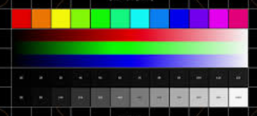
I think what I would like to see from the vendors of printing services is for them to send the customer a digital color/gama calibration block that the user could append to their digital image, such as this: . Maybe a bit more complex, but you get the idea. Then send the customer via mail the same image printed on the material that the customer intends to use. Given that, then there ought to be a way that the customer can display the image with the calibration panel in view on the monitor along side the physical calibration panel to match under the anticipated lighting. If the merged image and calibration panel were then opened in a simple viewing software package that set a precalibrated ICC profile, then the only thing to do is alter the image simply to make the physical and digital panels match. Then the calibration would be related to the printer and the substrate itself. Once set, then a few simple sliders on the software could easily be put to use then bring only the digital photo in line with the customer's expectations. Or just use the calibrated color panels, digital and physical to generate an ICC profile on the monitor, to match the printer's requirements. If I lived near the printer I use, I would probably just go into their facility and deal with this. Maybe I should look for a local outfit. . Maybe a bit more complex, but you get the idea. Then send the customer via mail the same image printed on the material that the customer intends to use. Given that, then there ought to be a way that the customer can display the image with the calibration panel in view on the monitor along side the physical calibration panel to match under the anticipated lighting. If the merged image and calibration panel were then opened in a simple viewing software package that set a precalibrated ICC profile, then the only thing to do is alter the image simply to make the physical and digital panels match. Then the calibration would be related to the printer and the substrate itself. Once set, then a few simple sliders on the software could easily be put to use then bring only the digital photo in line with the customer's expectations. Or just use the calibrated color panels, digital and physical to generate an ICC profile on the monitor, to match the printer's requirements. If I lived near the printer I use, I would probably just go into their facility and deal with this. Maybe I should look for a local outfit.
|
You cannot like this item. Reason: "ANONYMOUS".
You cannot remove your like from this item.
Editing a post is only allowed within 24 hours after creating it.
You cannot Like this post because the topic is closed.
Dale Penkala:
In the past I have always noticed a contrast difference in my images when I’d post them here on AB and commented about it on one of my images. I had a response to that comment and found that when I was saving the image I didn’t assign a ICC Profile (maybe you do but thought I’d mention it) and that is what was causing the contrast difference in my images once posted here on AB. Once I did this the image looks identical in my processing software PI and when its uploaded to AB.
Hi Dale,
I have now officially gone down a rabbit hole.
I did check the ICC Profile settings I had set for my monitor and also in PI under Color Management. I made sure that the PI was pointing to the same and tried different Intents. I saw no real differences to the image as seen prior, but I thought that I would at least get the ducks in a row. I also made sure that upon saving the images from PI that the ICC profile was copied to the saved images.
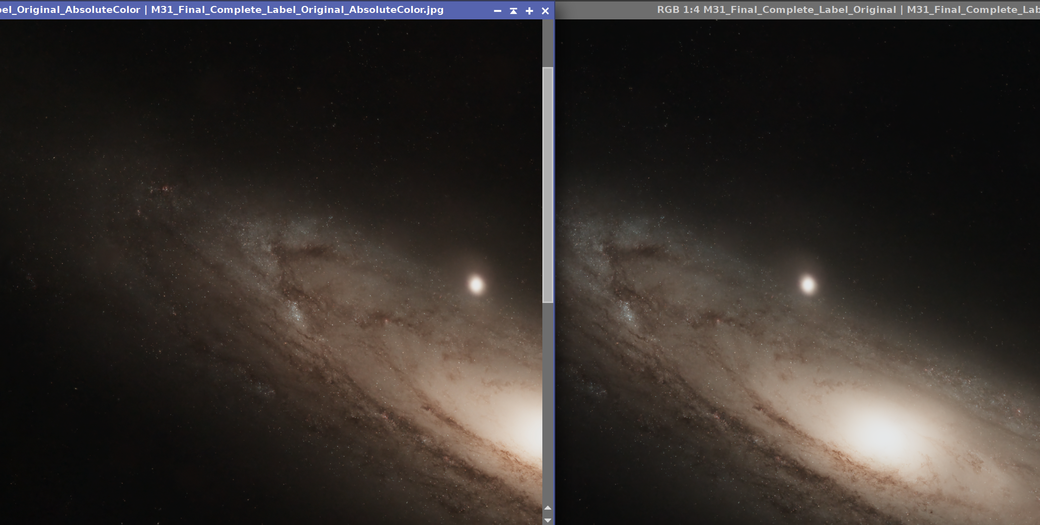
Here is where things get interesting. In PI, I opened my final version of the M31 image, It looked fine. I then opened the image displayed on my AB page and sized it so that I could view them side-by-side. Now I could see a difference! The AB page image looked a bit warmer. I will copy @George Hatfield here since he is the one who first mentioned this. (sometimes I am just stubborn!). I use JPG when I transfer my images to my AB account. So then I decided to directly open the JPG image that was directly derived from my XISF original and same thing, the JPG was still a bit too warm. I have no idea if this is because there is an effect upon image compression during JPG conversion. I also do not know if PI does or even if JPG can accept ICC Profile setting embedded in the image. I also tried to save in the other formats, PNG, etc. to no resolution. Same warm colors. Just wondering if any of this parallels what you were referring too in your first reply. In this case, it is color shift, not a contrast difference. I am attaching a screen capture below:

The JPG is labeled and the left image. I may have to start another Forum thread to deal with this unexpected issue. I can actually correct this on the JPG file directly in PI, but having to do so seems crazy.
|
You cannot like this item. Reason: "ANONYMOUS".
You cannot remove your like from this item.
Editing a post is only allowed within 24 hours after creating it.
You cannot Like this post because the topic is closed.
Alan Brunelle:
Dale Penkala:
In the past I have always noticed a contrast difference in my images when I’d post them here on AB and commented about it on one of my images. I had a response to that comment and found that when I was saving the image I didn’t assign a ICC Profile (maybe you do but thought I’d mention it) and that is what was causing the contrast difference in my images once posted here on AB. Once I did this the image looks identical in my processing software PI and when its uploaded to AB.
Hi Dale,
I have now officially gone down a rabbit hole.
@Dale Penkala and @George Hatfield. Well, I need to appologize to you both for almost dragging you down the rabbit hole with me. Turns out the image on the right panel I had done some minor adjustments with STF prior to bringing in the other panels for comparison as I was adjusting the PI color management settings. I then forgot to turn off the STF on that panel when comparing to my JPG files. So with that there is no difference between all permutations of these files, even when the file size is reduced on the JPG.
Again sorry, however, thanks for the help!
|
You cannot like this item. Reason: "ANONYMOUS".
You cannot remove your like from this item.
Editing a post is only allowed within 24 hours after creating it.
You cannot Like this post because the topic is closed.
Alan Brunelle:
Alan Brunelle:
Dale Penkala:
In the past I have always noticed a contrast difference in my images when I’d post them here on AB and commented about it on one of my images. I had a response to that comment and found that when I was saving the image I didn’t assign a ICC Profile (maybe you do but thought I’d mention it) and that is what was causing the contrast difference in my images once posted here on AB. Once I did this the image looks identical in my processing software PI and when its uploaded to AB.
Hi Dale,
I have now officially gone down a rabbit hole.
@Dale Penkala and @George Hatfield. Well, I need to appologize to you both for almost dragging you down the rabbit hole with me. Turns out the image on the right panel I had done some minor adjustments with STF prior to bringing in the other panels for comparison as I was adjusting the PI color management settings. I then forgot to turn off the STF on that panel when comparing to my JPG files. So with that there is no difference between all permutations of these files, even when the file size is reduced on the JPG.
Again sorry, however, thanks for the help!
No worries Alan, I’m glad you got it figured out from the comparison’s stand point. I hope you can get your original questions/problems figured out!
Dale
|
You cannot like this item. Reason: "ANONYMOUS".
You cannot remove your like from this item.
Editing a post is only allowed within 24 hours after creating it.
You cannot Like this post because the topic is closed.
Slightly OT but if you ever buy a new monitor and don't want to buy a calibrator, have a look at the ASUS ProArt line of monitors. They are pre-calibrated and are made specifically for graphics use. I have one and it is indistinguishable from an adjacent monitor that was calibrated by me with a calibrator.
Another point that I was unaware of until recently is that if you are using an OLED or HDR monitor and you want to calibrate those, they require a different and more expensive calibration device.
|
You cannot like this item. Reason: "ANONYMOUS".
You cannot remove your like from this item.
Editing a post is only allowed within 24 hours after creating it.
You cannot Like this post because the topic is closed.
Hey so the ICC profile is just a overlay ontop of the image to simulate the paper you're printing on, it will not get embeded into the image.
So you basically overlay the icc profile and then edit the photo to match the edit you had without the icc profile ontop of the image.
When you then print that image, the print should come out as you edited it with the icc profile applid even if the file maybe looks slightly off.
if you edit with the icc profile applied and then safe it, the safed image will look different than what you edited, since the icc profile won't be applied to the image. It won't help you much if you just edit the image for digital use, but as soon as you go over to a different output, like a printer, the icc profile is a great way to match the color of the analog output to the digital image. Of course, the monitor needs to be somewhat color calibrated.
maybe this is the problem on why the images look different sometimes.
|
You cannot like this item. Reason: "ANONYMOUS".
You cannot remove your like from this item.
Editing a post is only allowed within 24 hours after creating it.
You cannot Like this post because the topic is closed.
Bill McLaughlin:
Slightly OT but if you ever buy a new monitor and don't want to buy a calibrator, have a look at the ASUS ProArt line of monitors. They are pre-calibrated and are made specifically for graphics use. I have one and it is indistinguishable from an adjacent monitor that was calibrated by me with a calibrator.
Another point that I was unaware of until recently is that if you are using an OLED or HDR monitor and you want to calibrate those, they require a different and more expensive calibration device.
This is good to know Bill, thanks for sharing! I checked out a 27” on amazon and for 289.00 quite reasonable for a calibrated monitor, at least I think so!
Dale
|
You cannot like this item. Reason: "ANONYMOUS".
You cannot remove your like from this item.
Editing a post is only allowed within 24 hours after creating it.
You cannot Like this post because the topic is closed.
Jens:
Hey so the ICC profile is just a overlay ontop of the image to simulate the paper you're printing on, it will not get embeded into the image.
So you basically overlay the icc profile and then edit the photo to match the edit you had without the icc profile ontop of the image.
When you then print that image, the print should come out as you edited it with the icc profile applid even if the file maybe looks slightly off.
if you edit with the icc profile applied and then safe it, the safed image will look different than what you edited, since the icc profile won't be applied to the image. It won't help you much if you just edit the image for digital use, but as soon as you go over to a different output, like a printer, the icc profile is a great way to match the color of the analog output to the digital image. Of course, the monitor needs to be somewhat color calibrated.
maybe this is the problem on why the images look different sometimes.
In PixInsight under the channel management it states “assign an ICC Profile” when I do it I do it when I’m done with the image and it made the difference when I did the upload to AB. Maybe it works differently for printing. All I know it it fixed my issue with my uploads.
|
You cannot like this item. Reason: "ANONYMOUS".
You cannot remove your like from this item.
Editing a post is only allowed within 24 hours after creating it.
You cannot Like this post because the topic is closed.
Bill McLaughlin:
Slightly OT but if you ever buy a new monitor and don't want to buy a calibrator, have a look at the ASUS ProArt line of monitors. They are pre-calibrated and are made specifically for graphics use. I have one and it is indistinguishable from an adjacent monitor that was calibrated by me with a calibrator.
Another point that I was unaware of until recently is that if you are using an OLED or HDR monitor and you want to calibrate those, they require a different and more expensive calibration device.
Thank Bill,
I agree. I think that maybe most brands are getting better. I have a Samsung that I really like. I noticed that when I did the "calibration" when I got it, that the adjustments were very subtle compared to ones I had used in the past. I think that the differences in panels may have as much to do with marketing as much as anything else. My guess is the cheaper quality displays are tuned in a way to attract the customer with gaudy colors and contrast. The more expensive units likely tuned for the professional, who doesn't care or may actually be dissuaded by that sort of thing. My Samsung was reasonably priced, and not likely in the class of a professional display, however, I think now we are seeing the higher quality desceding down into the mid-priced units.
|
You cannot like this item. Reason: "ANONYMOUS".
You cannot remove your like from this item.
Editing a post is only allowed within 24 hours after creating it.
You cannot Like this post because the topic is closed.
Dale Penkala:
Jens:
Hey so the ICC profile is just a overlay ontop of the image to simulate the paper you're printing on, it will not get embeded into the image.
So you basically overlay the icc profile and then edit the photo to match the edit you had without the icc profile ontop of the image.
When you then print that image, the print should come out as you edited it with the icc profile applid even if the file maybe looks slightly off.
if you edit with the icc profile applied and then safe it, the safed image will look different than what you edited, since the icc profile won't be applied to the image. It won't help you much if you just edit the image for digital use, but as soon as you go over to a different output, like a printer, the icc profile is a great way to match the color of the analog output to the digital image. Of course, the monitor needs to be somewhat color calibrated.
maybe this is the problem on why the images look different sometimes.
In PixInsight under the channel management it states “assign an ICC Profile” when I do it I do it when I’m done with the image and it made the difference when I did the upload to AB. Maybe it works differently for printing. All I know it it fixed my issue with my uploads.
Dale and @Jens,
Actually it was this "assign an ICC Profile" upon saving an image to file, checkbox, that had me scared when I was struggling with what the effects might be on the final output image. Thinking I had screwed up something, when all along I had a tiny STF stretch left on. My questions (granted off-topic) still remain and is as follows: While I can see how PI XISF files can include the ICC profile info in the FITS header, I wonder how that is used in displaying the image. 1. Does it apply the ICC profile to the monitor profile when PI is active? 2. If so, does each image look different if there is a different profile listed within its header? I think not. Somewhere in my perusing in panic over my issue yesterday I seem to recall in the written PI info dialog that it can only be applied globally to the monitor. Either way, in PI Color Management, I tied the PI ICC profile to adopt the ICC profile set in my Windows Color Management. However, I can see how it be useful, for example if a printing vendor has its own ordering software, which can allow one to see how their digital file will look when printed on different media, then that software can change the monitor ICC profile only during its use so that the customer has an idea. Personally, I can imagine there being many pitfalls to that being any good, but....
The related question to the ones above is even if XISF files can carry ICC profile information in the Header, does that information get transferred to any format that AB allows for use by us users? I have been using JPG. Does JPG allow that? (Edit for the previous sentence: Does JPG contain ICC information?) It is my understanding that AB does not allow XISF for display, even though premium users can save XISF to their account.
|
You cannot like this item. Reason: "ANONYMOUS".
You cannot remove your like from this item.
Editing a post is only allowed within 24 hours after creating it.
You cannot Like this post because the topic is closed.
Thats a good question for @Salvatore Iovene but I’m sure that the XISF doesn’t and boy if it did it would be a huge file just for viewing it.
Dale
|
You cannot like this item. Reason: "ANONYMOUS".
You cannot remove your like from this item.
Editing a post is only allowed within 24 hours after creating it.
You cannot Like this post because the topic is closed.
Dale Penkala:
Thats a good question for @Salvatore Iovene but I’m sure that the XISF doesn’t and boy if it did it would be a huge file just for viewing it.
Dale
Yes, using XISF files for dispaying images in AB would be very problematic, I'm sure. And crush a lot of people's computers and certainly phones.
|
You cannot like this item. Reason: "ANONYMOUS".
You cannot remove your like from this item.
Editing a post is only allowed within 24 hours after creating it.
You cannot Like this post because the topic is closed.
Alan Brunelle:
Dale Penkala:
Thats a good question for @Salvatore Iovene but I’m sure that the XISF doesn’t and boy if it did it would be a huge file just for viewing it.
Dale
Yes, using XISF files for dispaying images in AB would be very problematic, I'm sure. And crush a lot of people's computers and certainly phones.
Agreed!
|
You cannot like this item. Reason: "ANONYMOUS".
You cannot remove your like from this item.
Editing a post is only allowed within 24 hours after creating it.
You cannot Like this post because the topic is closed.
The standard profile embedded in most jpg images is sRGB…a curve that generally compensates for a monitor’s tendency to falloff to black with dark grays. Gamma (analogous to contrast) is 2.2.
Applications like photoshop will read and calibrate to this. Website images viewed on browsers will not. However, if the image was made on a common computer monitor, the difference might be slight since the creator of the image would have adjusted it to look right on the same viewing medium everyone else is using.
Knowing this, many print shops assume sRGB in the absence of specific info and have their printers convert accordingly.
|
You cannot like this item. Reason: "ANONYMOUS".
You cannot remove your like from this item.
Editing a post is only allowed within 24 hours after creating it.
You cannot Like this post because the topic is closed.
to create to post a reply.